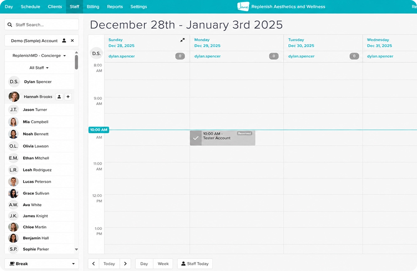
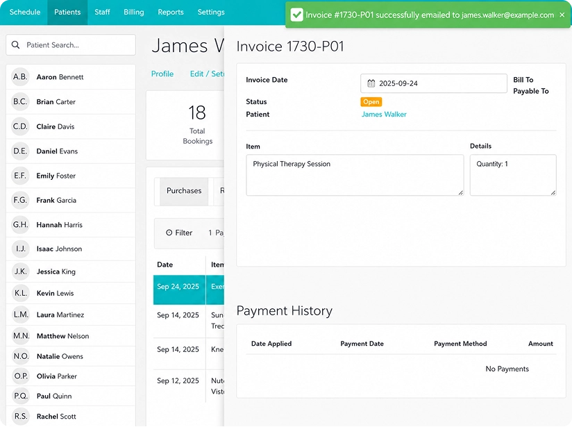
Before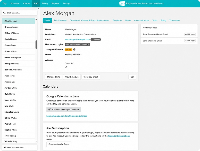
Cluttered metrics to Clear data visualization,
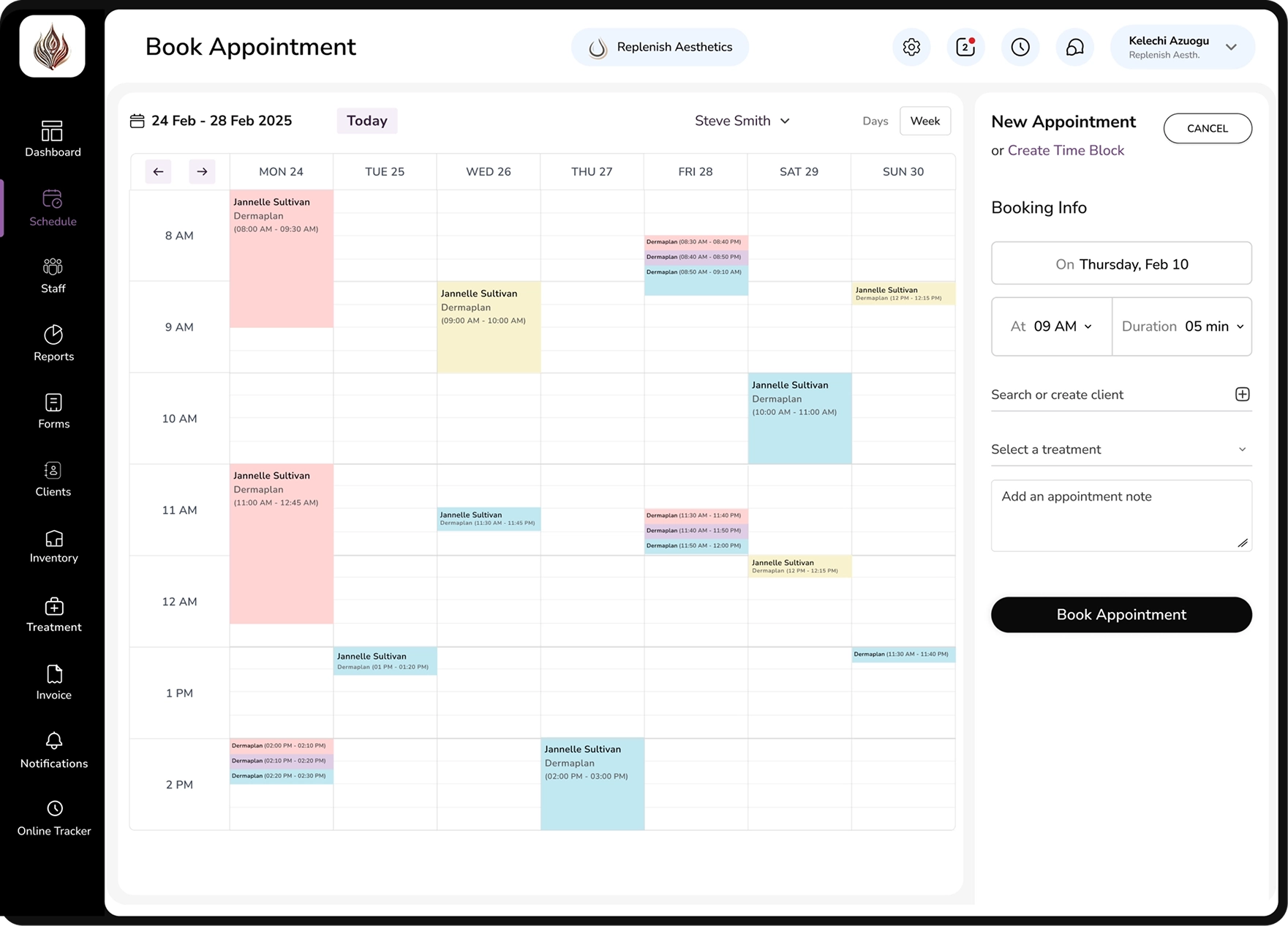
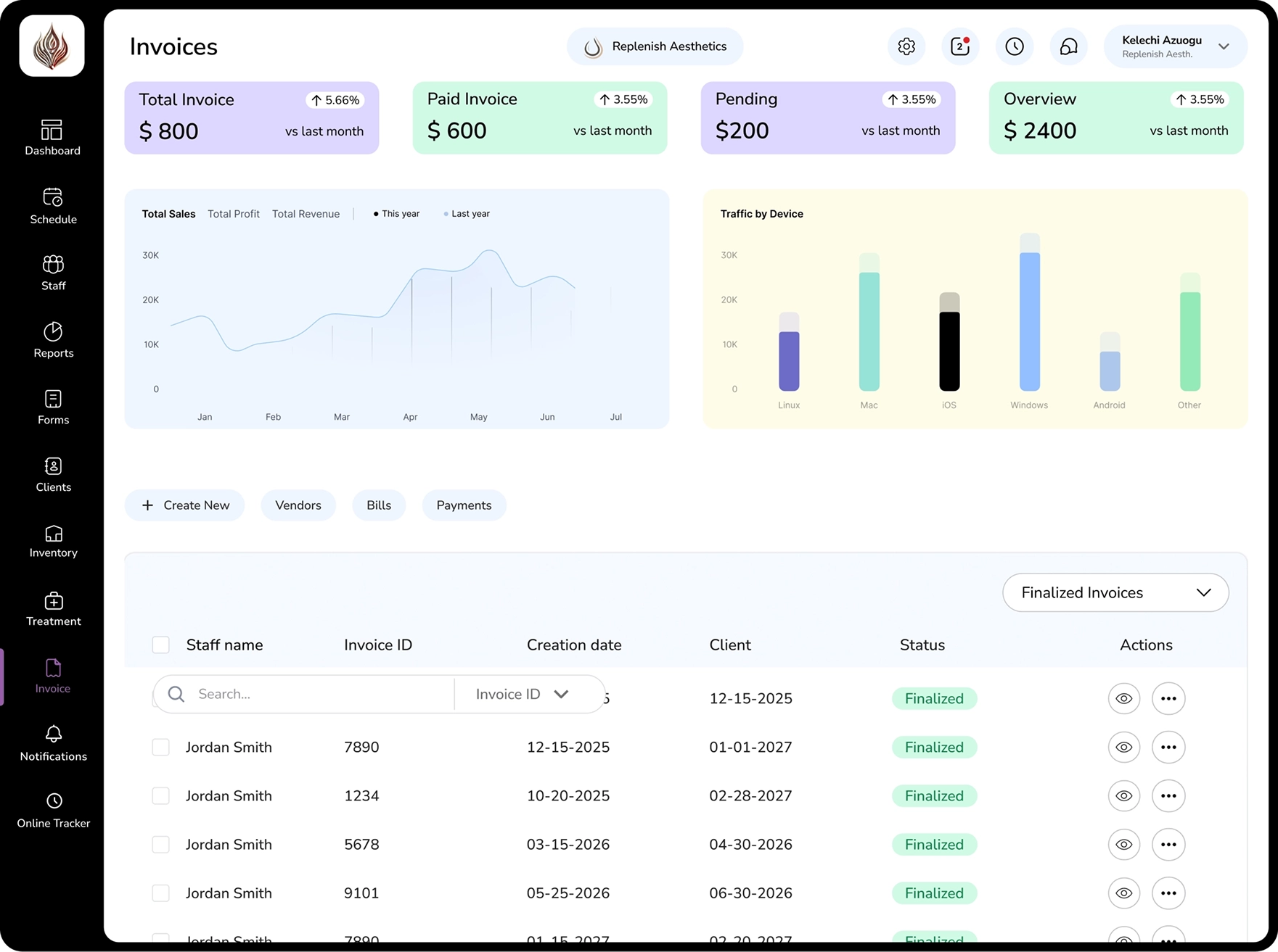
After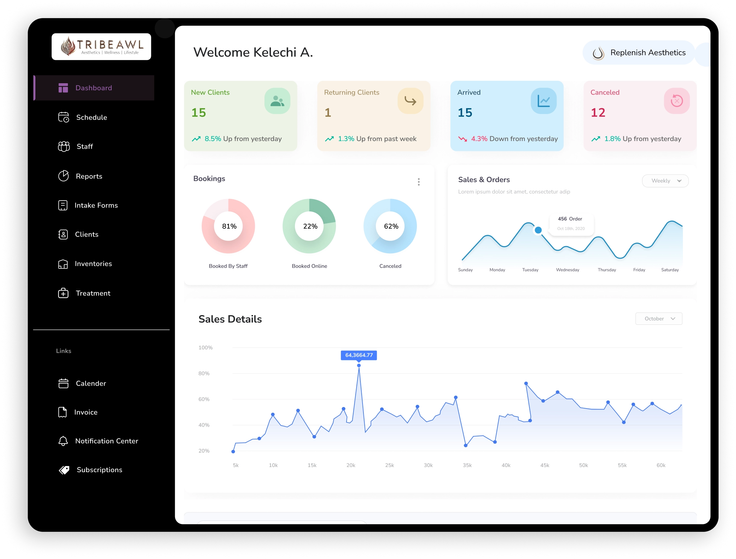
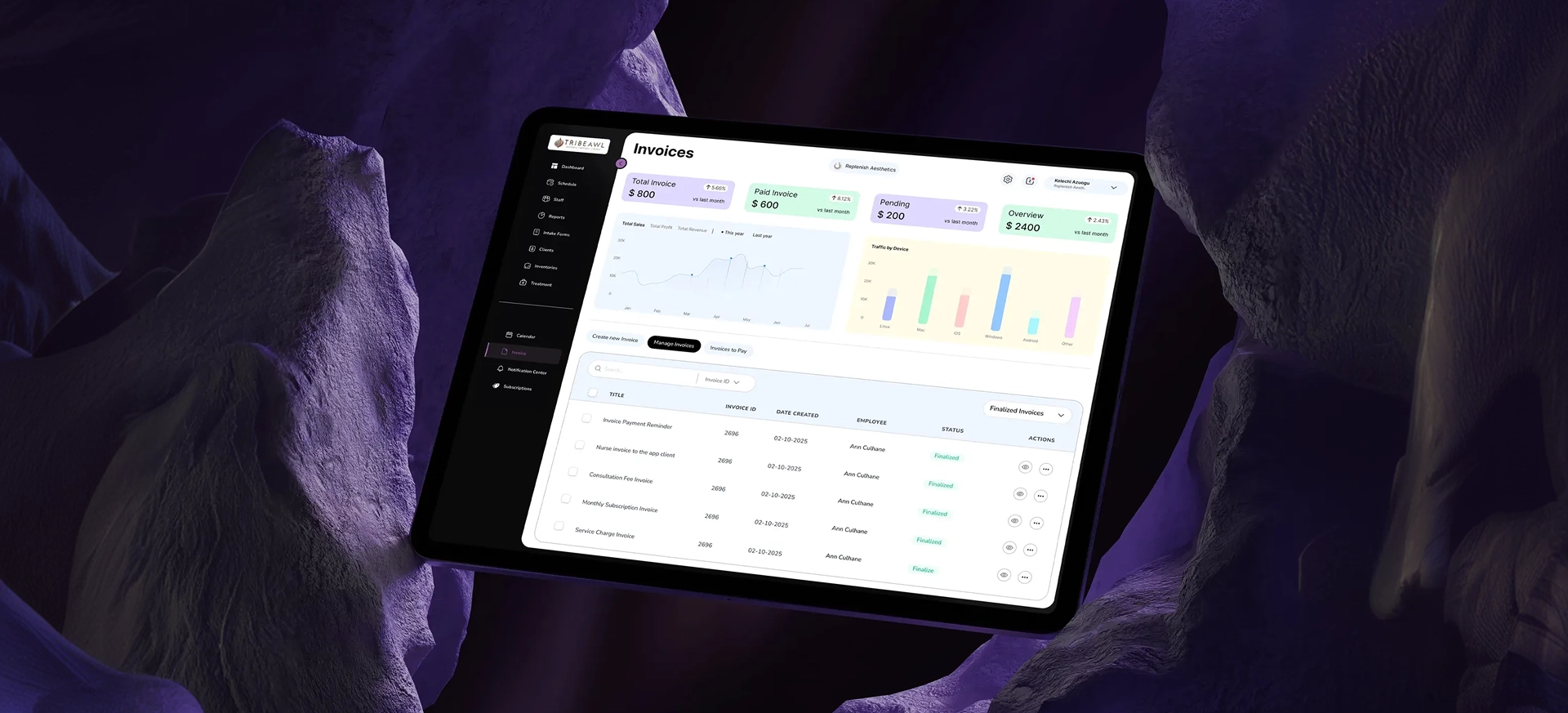
Redesigning a multi-role healthcare platform to simplify complex patient data. Built to connect real-time patient records with operational efficiency across all organizational levels.
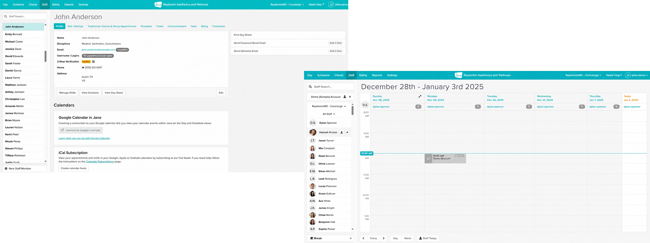
The existing platform overwhelmed users with cluttered interfaces and poor hierarchy, treating critical patient data as mere information dumps rather than actionable insights. This created confusion and slowed down clinical decision-making.
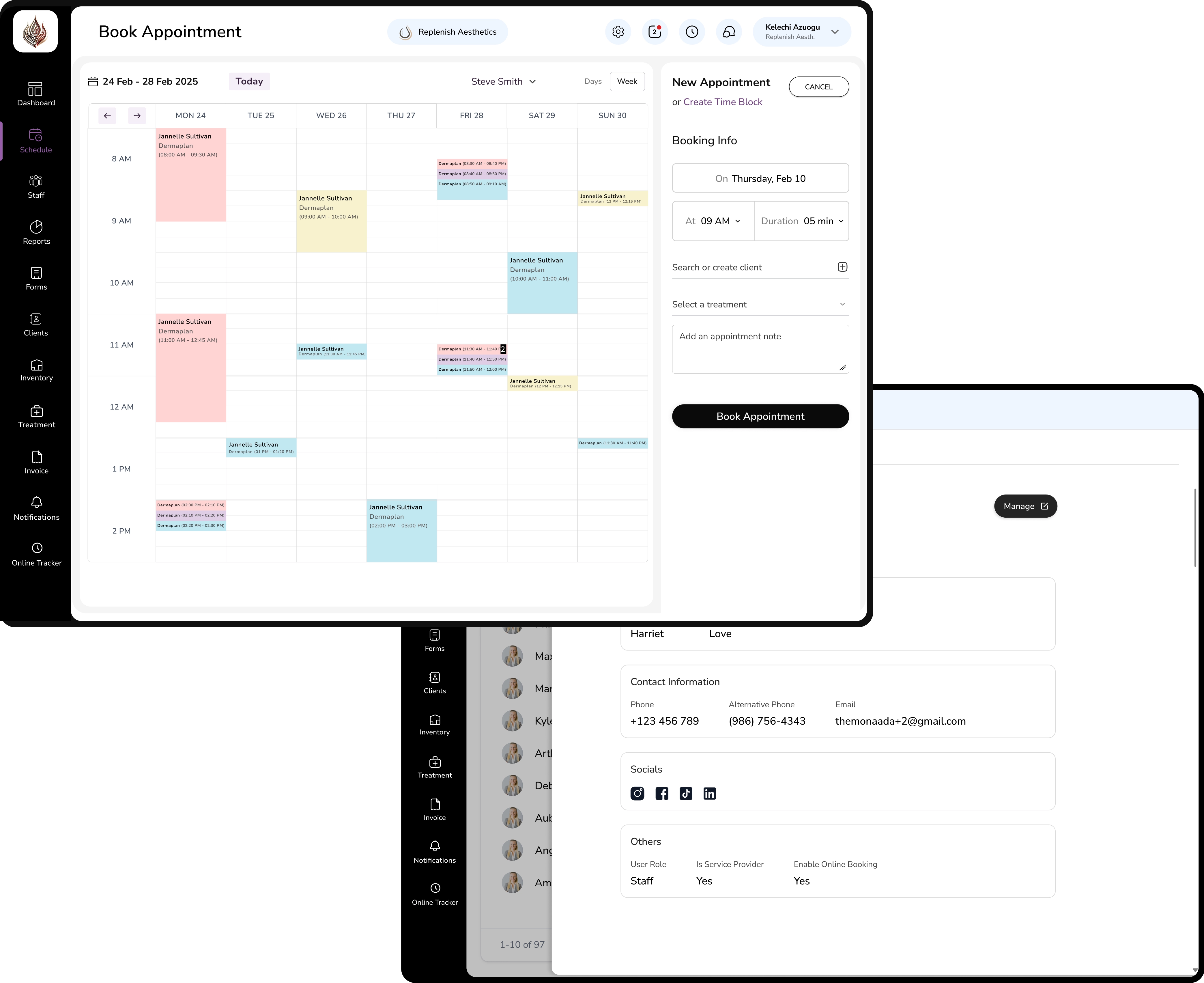
Solution: To build an intuitive system balancing data complexity with clarity.
Result: A modern, role-aware dashboard that transforms overwhelming information into efficient workflows. It streamlines navigation and visual hierarchy, effectively empowering clinicians and admins with focused, tailored precision.
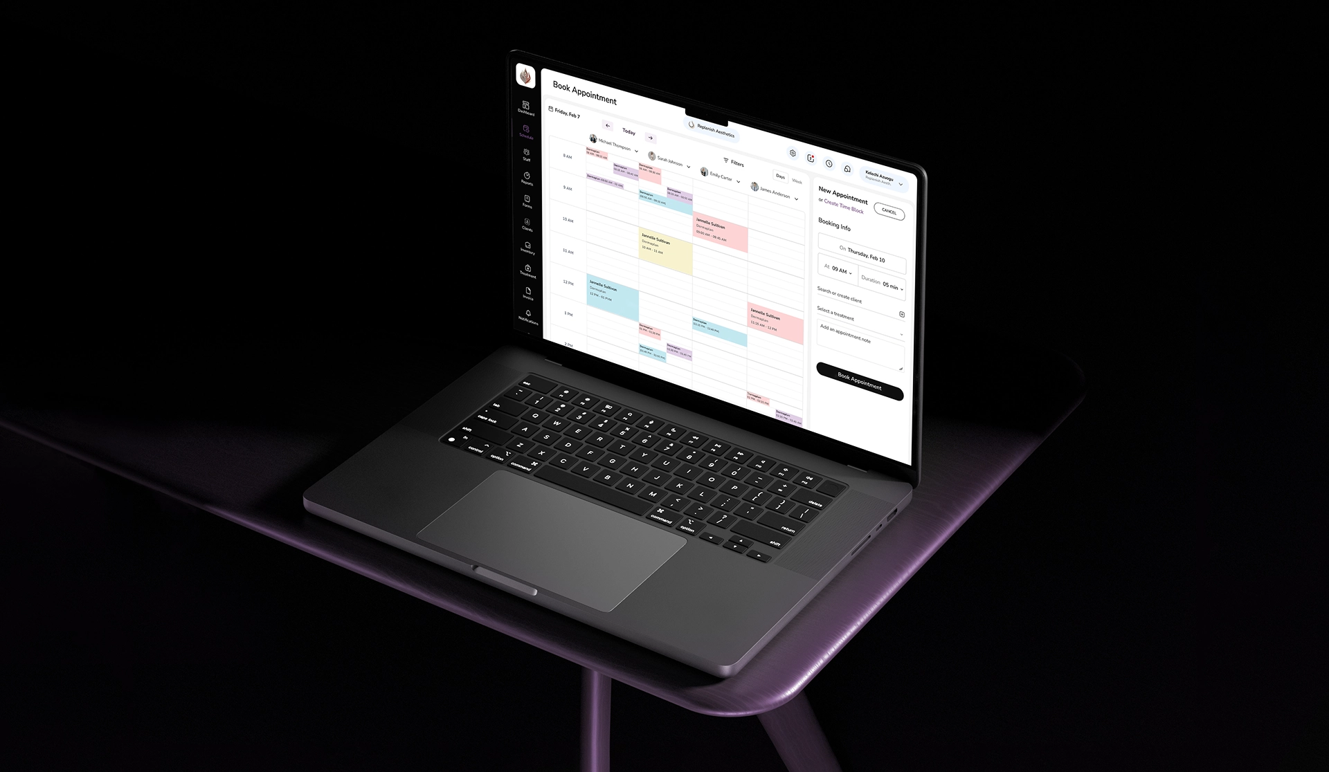
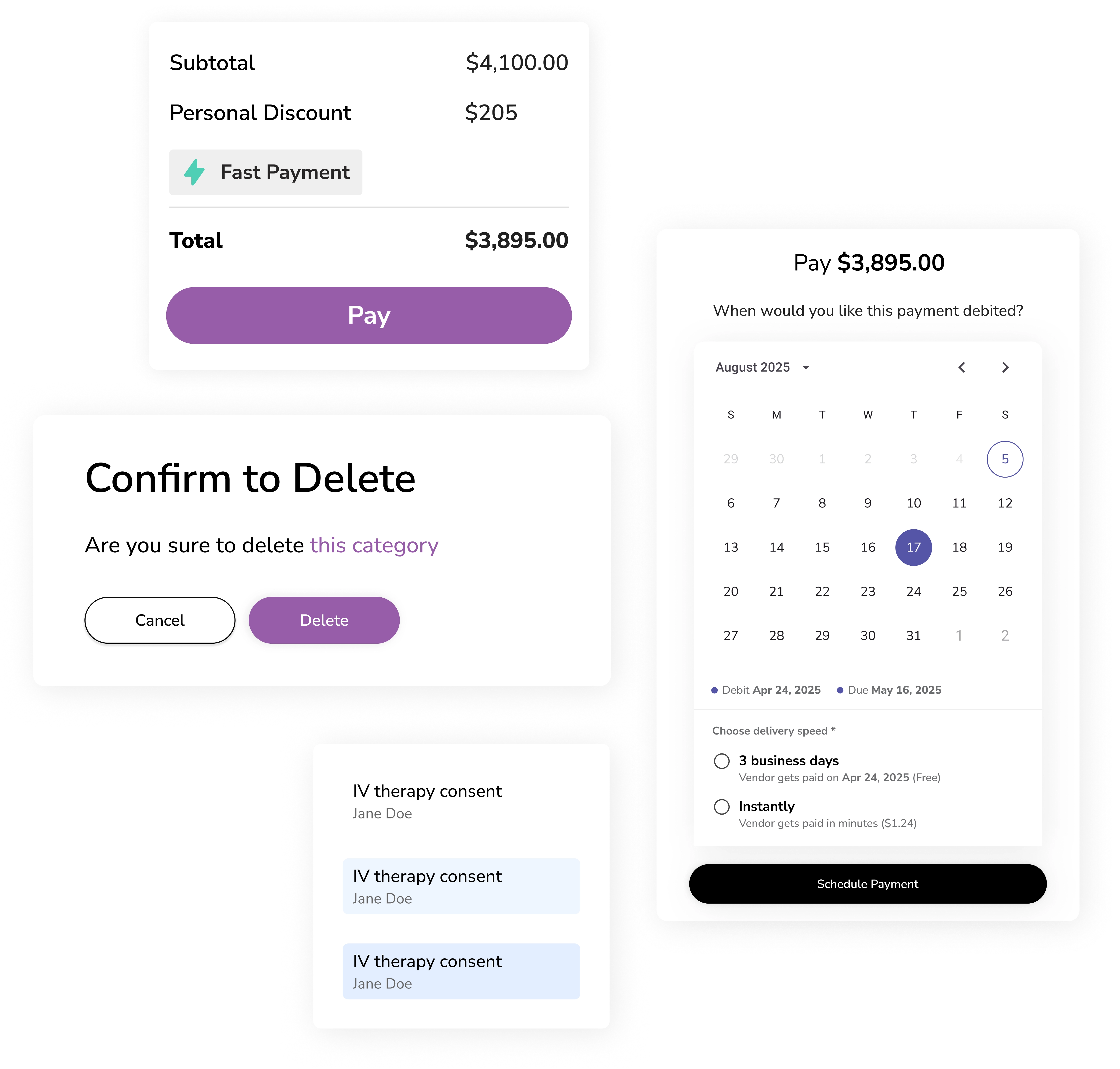
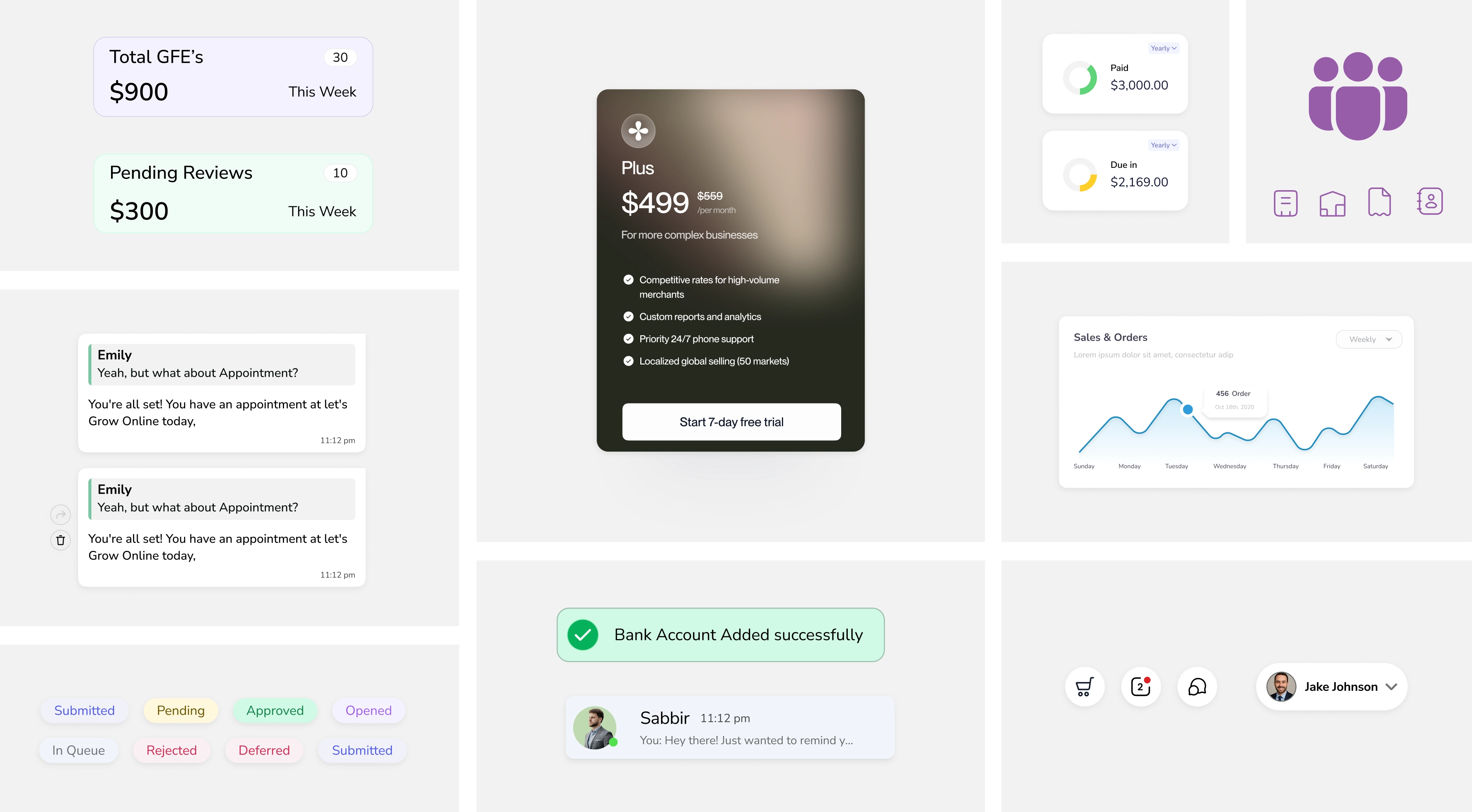
A cohesive graphic language that reflects Replenish values with clarity and trust.
Cluttered metrics to Clear data visualization,
Color-coded calendar with fast booking and real-time capacity overview.
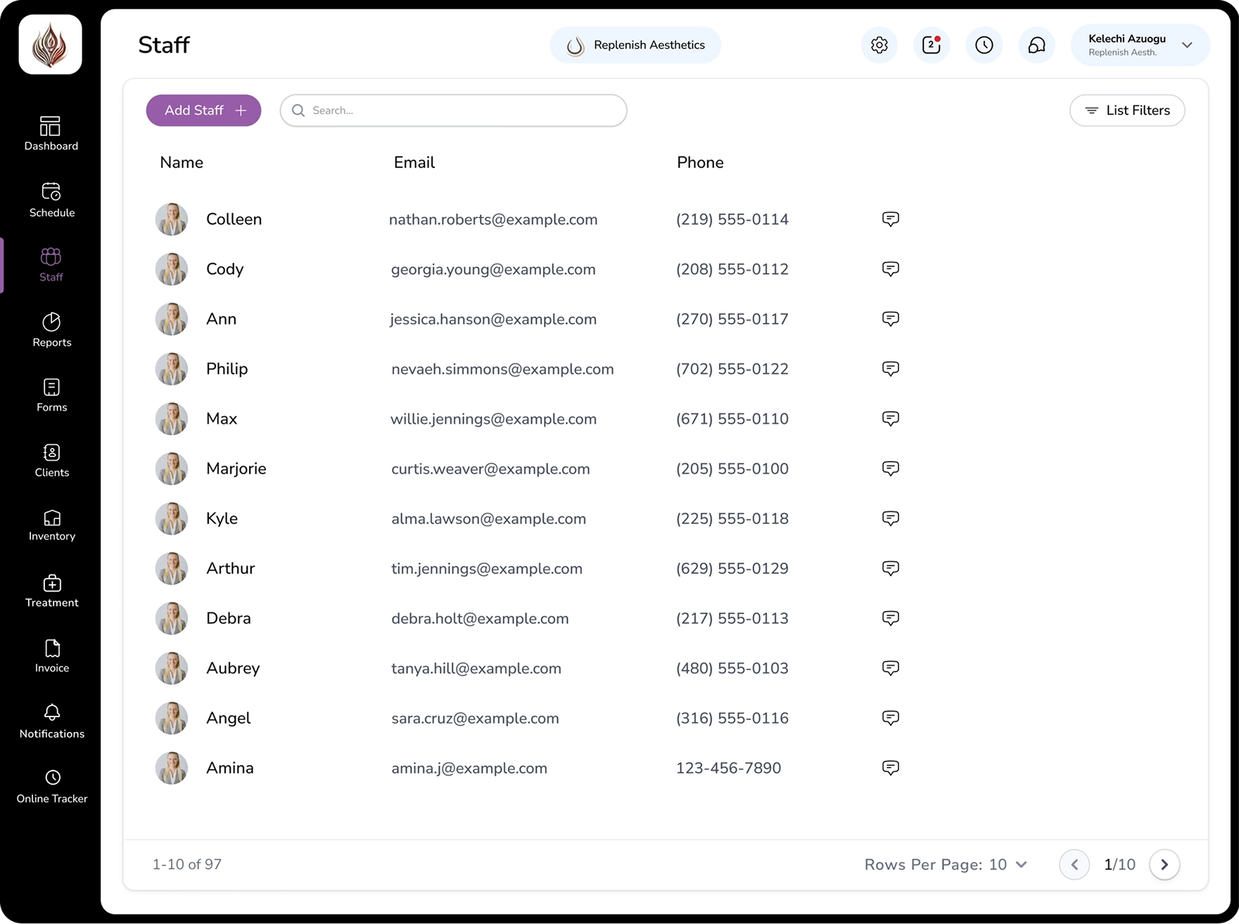
Redesigned staff interface for quick access to key information with organized, drill-down details.
Streamlined invoice management with clearer data visualization
We chose Nunito Sans for its high readability, clean structure, and soft, approachable feel. Its simple styling improves clarity across all screens, making medical information easy to scan and accessible for users of all age groups while maintaining a professional healthcare tone.
Nunito Sans
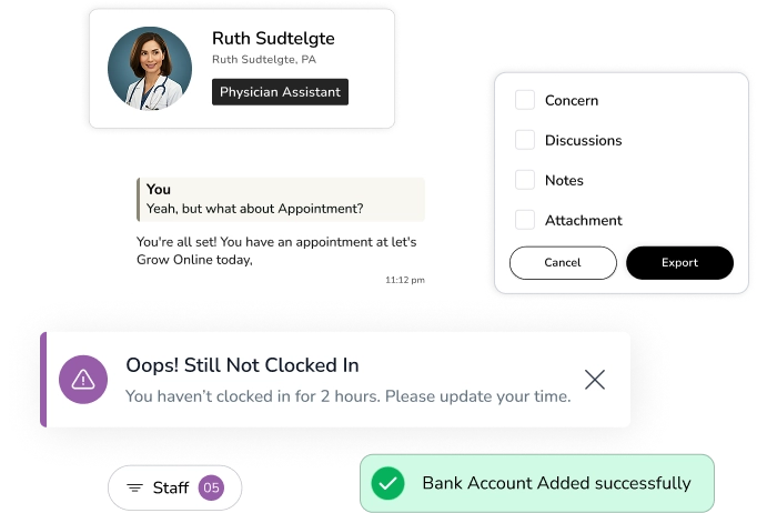
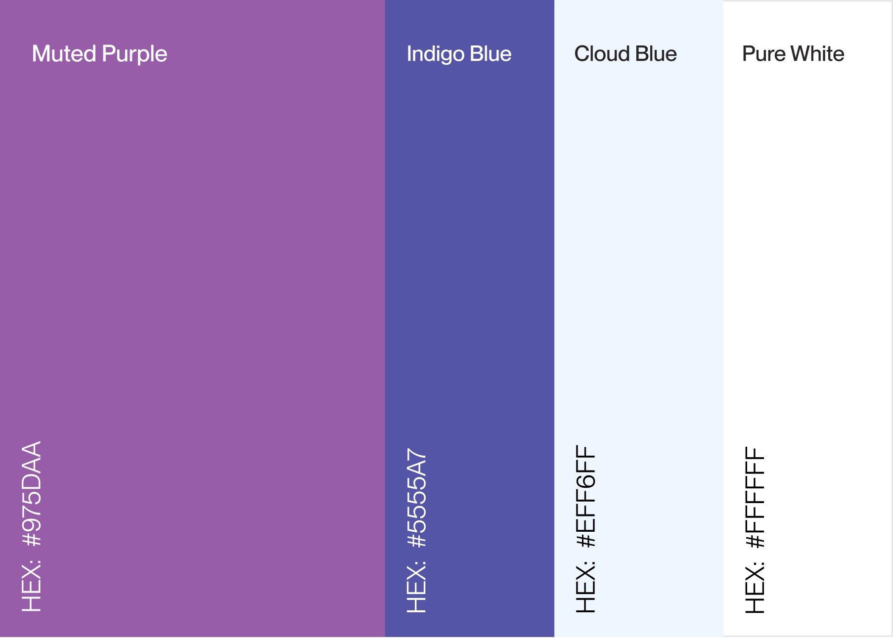
Purple is used as the primary accent to add depth and a distinct visual identity. The core interface stays minimal with black and white typography for clarity and balance. Supporting tones enhance interactions while keeping the experience clean and focused.